gryphon house
branding & identity design
BRANDING
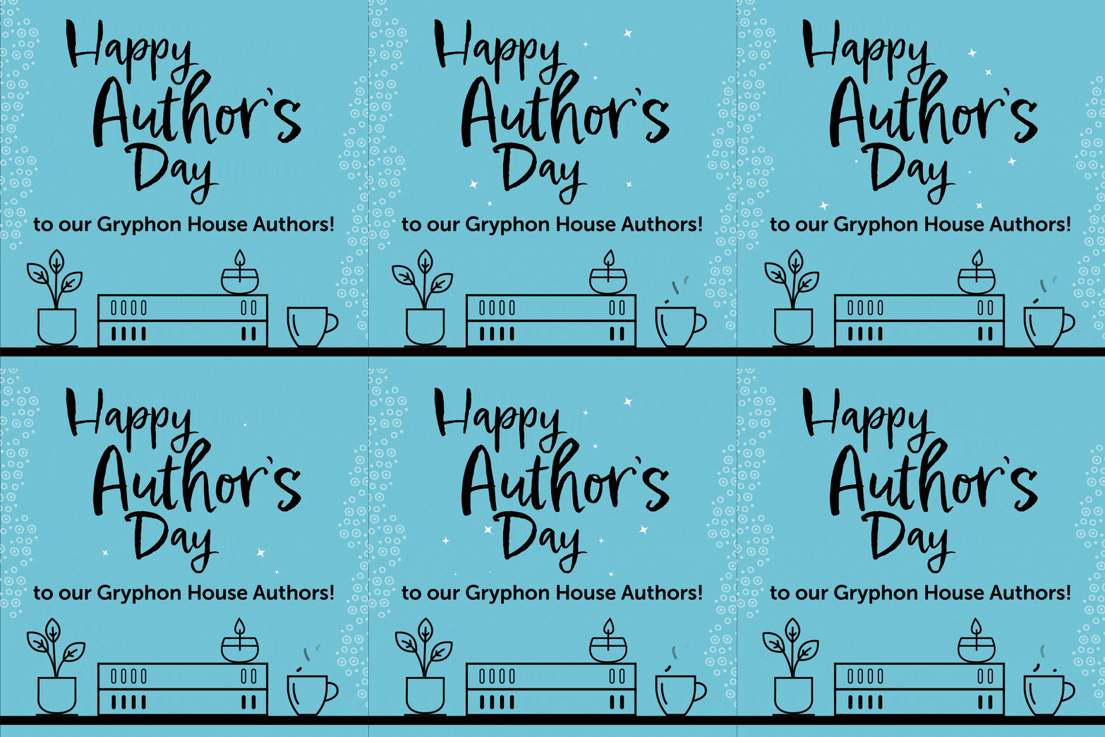
As Senior Designer for Gryphon House, I was tasked with rebranding the company to refresh its look and revamp its digital presence. The logo and 2 brand colors (teal & purple) already existed, so I had to work around that to bring an updated feel to this brand. I wanted the overall feel of Gryphon House to be casual, slightly quirky, and friendly. New, vibrant colors were added to lighten and brighten. Illustrations (such as the bookshelves and items) were added that were either created by me or sourced. Repeating patterns were created and could be applied in any color scheme necessary.
Navigating the revitalization of Gryphon House's social presence was tricky, because I had to incorporate each book's design style into Gryphon House's overall branding style. In order to achieve this, I created seamless instagram carousels that allowed each book's social post to have its own unique style, and designed book release templates to create consistency in book announcements. I also incorporated custom animations for a new eye-catching approach, and created 7 brand new email templates to drive this new branding even further.
project vibe
new vibrant colors to balance the existing teal and purple, young, slightly whimsical
specs
branding, colors, illustrations, social & email templates, style guides
style guide


social media animations


trade digital catalog

emails

NAEYC trade show booth design


